Tilt Card — React Interaction
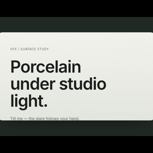
A porcelain card on a gimbal: the surface tilts in space while a specular highlight tracks the pointer across it.
Starting live preview
Usage
import { TiltCard } from "@/components/TiltCard";

export function Card() {
  return <TiltCard tilt={10} glare={0.55}
    {...{
      tilt: 10,
      glare: 0.55,
      radius: 20
    }}
  ><div style={{ padding: 32 }}>Your content rides here.</div></TiltCard>;
}Implementation notes & API
Accepts children, tilt, glare, radius, disabled, className and style. Real DOM content rides a raised layer for parallax; keyboard focus brings the highlight home, and reduced motion leaves a flat, fully readable card. Works without WebGPU.
| Property | Type | Notes / default |
|---|---|---|
children | ReactNode | Your own content; the default is a demonstration |
disabled | boolean | false; motion also respects system preferences |
className / style | string / CSSProperties | Applied to the outer container |
View source on GitHubFree for commercial projects · MIT