Hero Aurora Editorial — React Hero Section
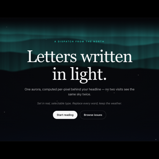
Drop-in hero: a centered serif masthead — display title, two standfirst lines, dual CTAs — under full-bleed aurora curtains, with a radial scrim holding WCAG AA contrast.
Usage
import { HeroAuroraEditorial } from "@/components/HeroAuroraEditorial";

export function Landing() {
  return (
    <section style={{ height: "max(640px, 100svh)" }}>
      <HeroAuroraEditorial
        title="Your next big idea."
        subtitle="Replace this with your own story."
        primaryCta={{ label: "Get started", href: "/start" }}
        secondaryCta={null}
        interactive
        {...{
          interactive: true,
          title: "Letters written\nin light.",
          subtitle: "One aurora, computed per-pixel behind your headline — no two visits see the same sky twice."
        }}
      />
    </section>
  );
}Implementation notes & API
Purpose: drop-in hero section — a full first screen with real, selectable DOM text (centered layout) over a GPU aurora background. Copy it, ship it. Mount: give the parent an explicit height (e.g. height: 100dvh or a min-height); the shell fills it and clamps its own type with container queries. Props: eyebrow, title, subtitle, primaryCta, secondaryCta, badges, scheme ("dark" | "light"), accent, plus the aurora shader uniforms. Default copy is for demonstration. Supply your own content and CTA href or onClick; children replaces the content stack. Interaction: the aurora background animates on its own; text and CTAs are plain DOM (WCAG AA scrim, screen-reader readable). Guardrails: WebGPU required with graceful degradation; SSR renders inert DOM; prefers-reduced-motion freezes the shader and skips the entrance animation. Do not stack two heroes on one screen.
| Property | Type | Notes / default |
|---|---|---|
title / subtitle | ReactNode | Your content; named heroes include example copy |
eyebrow | string | Optional short label |
primaryCta / secondaryCta | string | HeroCta | null | { label, href } or { label, onClick }; null hides the action |
children | ReactNode | Replaces the entire default content stack |
interactive | boolean | false in the library; enabled in this preview |
scheme | "dark" | "light" | dark |
className / style | string / CSSProperties | Applied to the hero section |
fallback | ReactNode | Content shown if the background renderer is unavailable |