Glass Panel — React Glass Effect
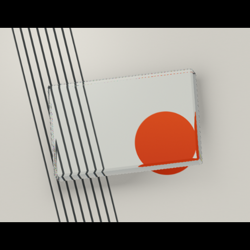
An original ray-marched optical slab built to carry content: beveled edges split light while the solid tilts toward your pointer, and real DOM content rides above it.
Usage
import { GlassPanel } from "@/components/GlassPanel";

export function Panel() {
  return (
    <div style={{ height: 520 }}>
      <GlassPanel interactive
        {...{
          interactive: true,
          radius: 0.022,
          shine: 0.62,
          panelScale: 1.12,
          tint: "#dfe9ec"
        }}
      >
        <div style={{ padding: 40, position: "relative", zIndex: 1 }}>
          <h2>Your content, on glass.</h2>
        </div>
      </GlassPanel>
    </div>
  );
}Implementation notes & API
Original ray-marched rounded slab with entry/exit refraction, Fresnel edges and thickness-dependent absorption — sized as a wide panel rather than a card. children accepts real DOM content above the artwork. Provide a sized parent; the slab centers itself at panelScale. Pointer tilts the solid (interactive is on by default here). radius is the bevel, shine the dispersion, borderGlow the edge reflection, tint the absorption color, contentWidth the inner column (percent). The printed scene behind the glass is procedural; arbitrary DOM is not sampled. Reduced motion freezes time and pointer motion.
| Property | Type | Notes / default |
|---|---|---|
interactive | boolean | false in the library; enabled in this preview |
fallback | ReactNode | Shown when the renderer is unavailable |
className / style | string / CSSProperties | Applied to the outer container |