Glass Card — React Glass Effect
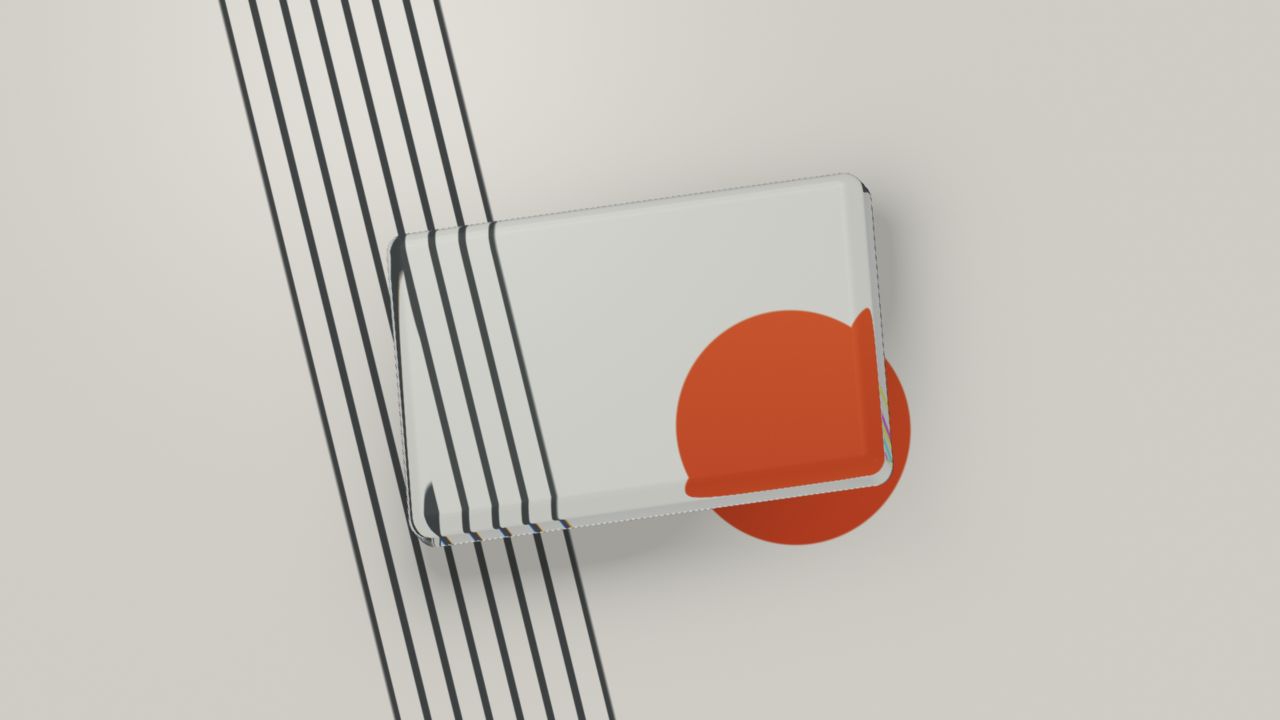
Thick-cut glass over a printed studio scene. Beveled edges split light while the solid tilts toward your pointer.
Starting live preview
Usage
import { GlassCard } from "@/components/GlassCard";

export function GlassPanel() {
  return <div style={{ height: 520 }}><GlassCard interactive
    {...{
      interactive: true,
      radius: 0.05,
      borderGlow: 0.7,
      shine: 0.8,
      cardScale: 0.62,
      tint: "#e4edf0"
    }}
  /></div>;
}Implementation notes & API
Original ray-marched rounded solid with entry/exit refraction, Fresnel reflections and thickness-dependent absorption. The printed scene is procedural; this component does not refract arbitrary DOM behind the canvas. children accepts real DOM content above the artwork. No demonstration copy is built in. Pointer tilts the solid. Set interactive=false for autonomous studio motion. Reduced motion freezes time and disables pointer motion. Provide a sized parent. Existing preset IDs and props remain supported; their visual rendering has been replaced.
| Property | Type | Notes / default |
|---|---|---|
interactive | boolean | false in the library; enabled in this preview |
fallback | ReactNode | Shown when the renderer is unavailable |
children | ReactNode | DOM content above the decorative glass field |
className / style | string / CSSProperties | Applied to the outer container |
View source on GitHubFree for commercial projects · MIT