Block Pricing — React Page Block
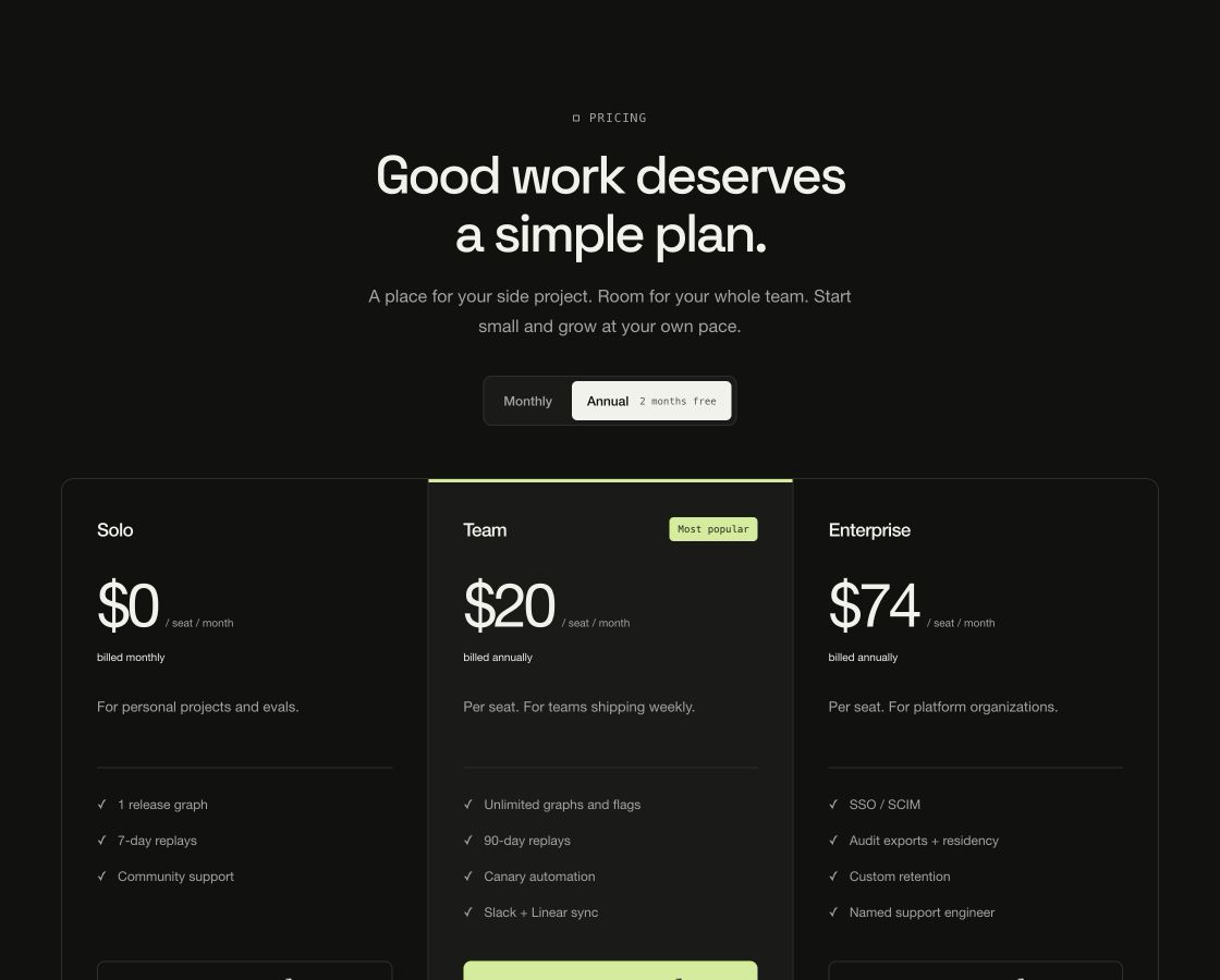
Pricing plans with a working monthly/annual switch: amounts, billing basis and the savings pill all render from data, so the toggle can never lie. No payment backend.
Usage
import { BlockPricing } from "@/components/BlockPricing";

export function Plans() {
  return (
    <BlockPricing
      title="Start free. Scale when the graph does."
      plans={[
        { name: "Solo", priceMonthly: 0, basis: "month", features: ["1 release graph"], cta: { label: "Start free", href: "/start" } },
        { name: "Team", priceMonthly: 24, priceAnnual: 20, featured: true, cta: { label: "Start trial", href: "/trial" } },
      ]}
      {...{
        title: "Good work deserves a simple plan.",
        defaultPeriod: "annual",
        annualNote: "2 months free",
        accent: "#d5ed9a",
        scheme: "dark"
      }}
    />
  );
}Implementation notes & API
Purpose: pricing section with billing-period switching. Copy it, ship it — every string, link and color arrives through props. Runtime: pure DOM + CSS. No WebGPU, canvas, animation library or external assets; SSR-safe on first render. Theming: root custom properties (--vb-bg, --vb-fg, --vb-accent, --vb-border, --vb-radius, --vb-container) or the accent/scheme/className/style props. scheme flips the dark default to light. Guardrails: responsive via container queries down to 320px; interactive behavior degrades on touch; prefers-reduced-motion drops entrance/scroll motion while content stays complete. basis:'month' prices per seat per month and flips with the toggle; basis:'once' ignores the toggle (one-time). CTAs are plain links/buttons — wire your checkout.
| Property | Type | Notes / default |
|---|---|---|
eyebrow / title / description | ReactNode | Section header |
plans | readonly PricingPlan[] | { name, priceMonthly, priceAnnual?, basis?, description?, features?, cta?, featured?, badge? } |
periodToggle | boolean | true; hidden automatically when no plan has priceAnnual |
defaultPeriod | "monthly" | "annual" | annual |
annualNote | string | Pill on the annual toggle, e.g. "2 months free" |
footnote | ReactNode | Fine print under the grid |
scheme | "dark" | "light" | dark |
accent | string (hex) | Sets --vb-accent for the whole block |
className / style | string / CSSProperties | Applied to the section root |
children | ReactNode | Replaces the default content entirely |