Block Integrations — React Page Block
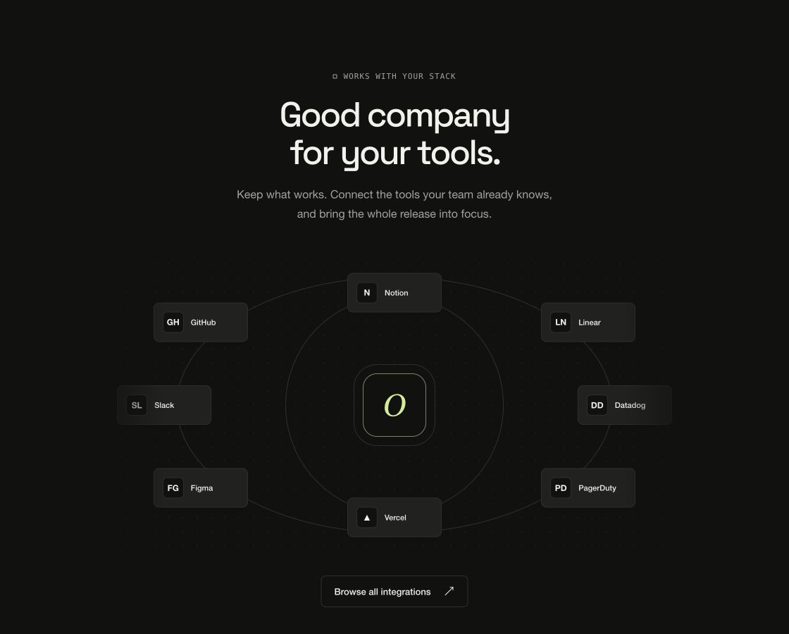
Integrations hub: your product at the center of two connection rings of rebrandable tool tiles, with an always-available link grid below and on touch layouts.
Usage
import { BlockIntegrations } from "@/components/BlockIntegrations";

export function Stack() {
  return (
    <BlockIntegrations
      brand="Orbit"
      title="Plugs into the tools you already trust."
      integrations={[
        { name: "GitHub", href: "/integrations/github", description: "Sync releases with GitHub." },
        { name: "Linear", href: "/integrations/linear" },
        { name: "Slack", href: "/integrations/slack" },
      ]}
      {...{
        brand: "Orbit",
        layout: "orbit",
        accent: "#d5ed9a",
        scheme: "dark"
      }}
    />
  );
}Implementation notes & API
Purpose: integration/compatibility hub. Copy it, ship it — every string, link and color arrives through props. Runtime: pure DOM + CSS. No WebGPU, canvas, animation library or external assets; SSR-safe on first render. Theming: root custom properties (--vb-bg, --vb-fg, --vb-accent, --vb-border, --vb-radius, --vb-container) or the accent/scheme/className/style props. scheme flips the dark default to light. Guardrails: responsive via container queries down to 320px; interactive behavior degrades on touch; prefers-reduced-motion drops entrance/scroll motion while content stays complete. The connection diagram is static and every tile stays upright; every tool tile is a real link you rebrand and relink. Touch layouts (<=820px) always get the grid.
| Property | Type | Notes / default |
|---|---|---|
eyebrow / title / description | ReactNode | Section header |
brand | string | Center node label; logo replaces its monogram |
logo | ReactNode | Your mark for the center node |
integrations | readonly Integration[] | { name, description?, href?, logo? } — first 8 orbit |
action | { label, href? , onClick? } | null | Button under the diagram |
layout | "orbit" | "grid" | orbit; grid skips the diagram everywhere |
scheme | "dark" | "light" | dark |
accent | string (hex) | Sets --vb-accent for the whole block |
className / style | string / CSSProperties | Applied to the section root |
children | ReactNode | Replaces the default content entirely |