Block CTA — React Page Block
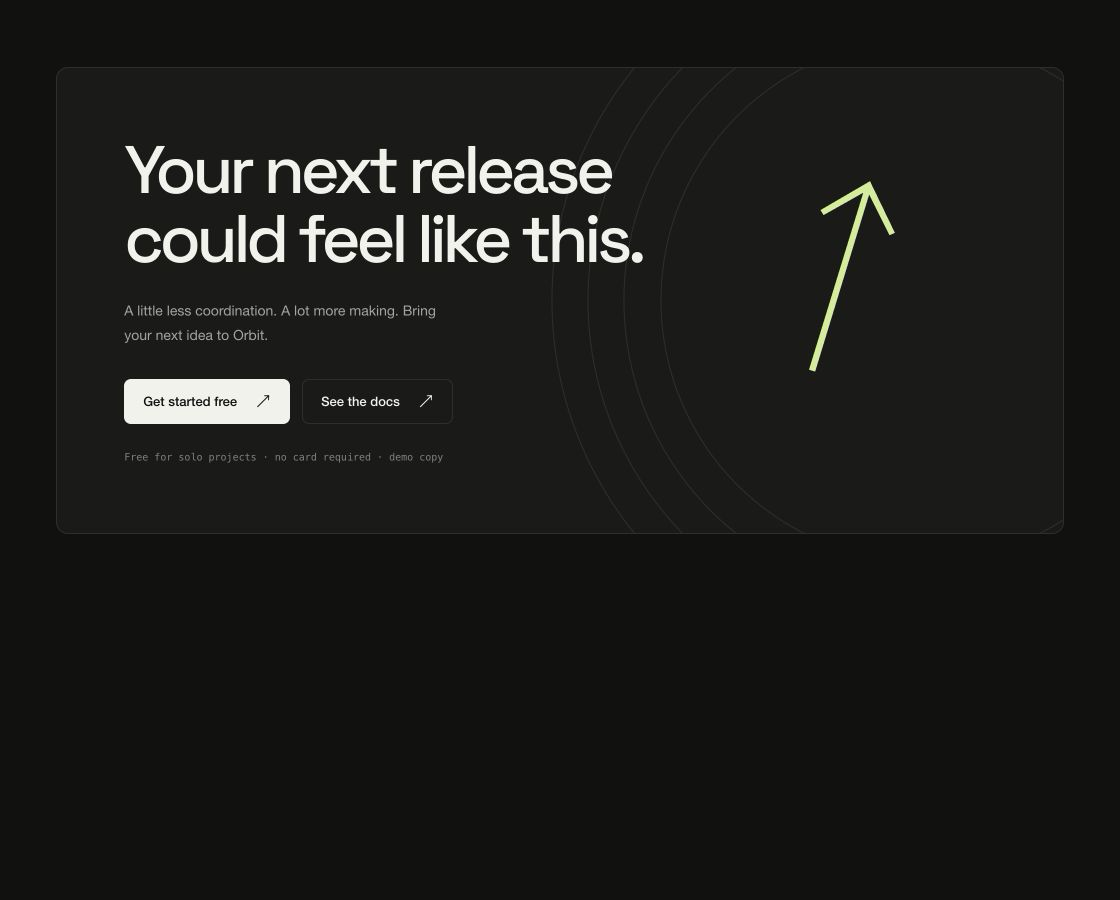
Closing call to action: headline, supporting copy, primary and secondary actions and a replaceable brand visual layer — a concentric line artwork by default, any background component or media if you pass one.
Usage
import { BlockCta } from "@/components/BlockCta";
import { WaveBackground } from "@/components/WaveBackground";

export function Closing() {
  return (
    <BlockCta
      title="Your next release could feel like this."
      primaryCta={{ label: "Get started free", href: "/start" }}
      secondaryCta={{ label: "See the docs", href: "/docs" }}
      media={<WaveBackground speed={0.55} interactive={false} />}
      {...{
        title: "Your next release could feel like this.",
        description: "A little less coordination. A lot more making. Bring your next idea to Orbit.",
        note: "Free for solo projects · no card required · demo copy",
        accent: "#d5ed9a",
        scheme: "dark"
      }}
    />
  );
}Implementation notes & API
Purpose: closing call-to-action section. Copy it, ship it — every string, link and color arrives through props. Runtime: pure DOM + CSS. No WebGPU, canvas, animation library or external assets; SSR-safe on first render. Theming: root custom properties (--vb-bg, --vb-fg, --vb-accent, --vb-border, --vb-radius, --vb-container) or the accent/scheme/className/style props. scheme flips the dark default to light. Guardrails: responsive via container queries down to 320px; interactive behavior degrades on touch; prefers-reduced-motion drops entrance/scroll motion while content stays complete. Concentric line artwork gives the closing panel its structure. Supply media for a custom image, video or GPU background; the default block uses DOM/CSS only.
| Property | Type | Notes / default |
|---|---|---|
eyebrow / title / description | ReactNode | Replaceable copy |
primaryCta / secondaryCta | { label, href? , onClick? } | null | Actions; null hides one |
media | ReactNode | Decorative layer (WaveBackground, image, video); default is concentric line artwork |
note | ReactNode | Reassurance line under the actions |
layout | "panel" | "banner" | panel floats a card; banner runs full-bleed |
scheme | "dark" | "light" | dark |
accent | string (hex) | Sets --vb-accent for the whole block |
className / style | string / CSSProperties | Applied to the section root |
children | ReactNode | Replaces the default content entirely |